01 -- Typographic Rules
Clean Text, Automatically
Five rules that turn raw text into clean, well-set copy. Each uses non-breaking spaces to control line breaks without changing your content.
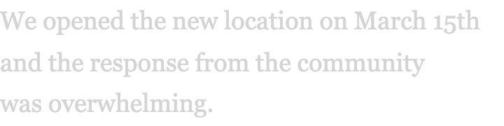
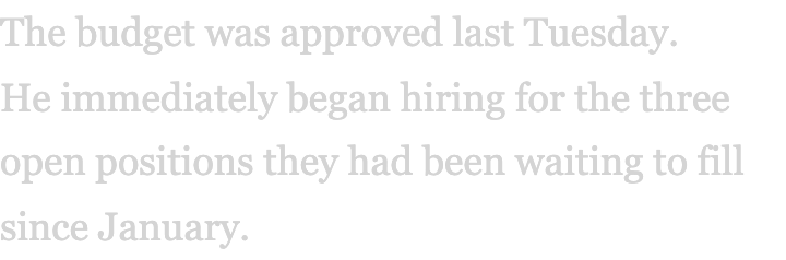
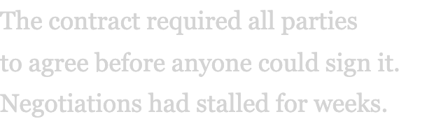
No Orphans
The last word of a paragraph shouldn't sit alone on its own line. Typeset binds it to the word before it.
Default
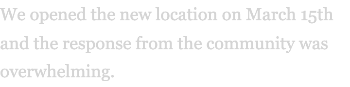
With typeset
Sentence-Start Protection
When a sentence begins near the end of a line, the first word can get stranded alone. Typeset keeps the opening two words of each sentence together.
Default
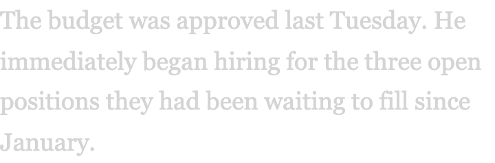
With typeset
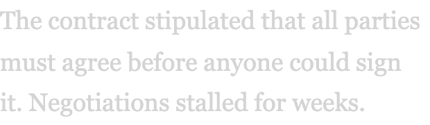
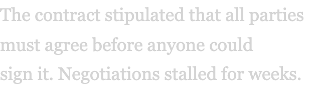
Sentence-End Protection
Short closing words like “it,” “to,” and “so” shouldn’t sit alone at the end of a sentence. Typeset pulls them back to the line before.
Default
With typeset
Break Optimization
The browser breaks lines greedily — fill until full, then wrap. This leaves prepositions stranded, articles orphaned, and sentences split mid-thought. Break optimization uses dynamic programming to evaluate every possible configuration, keeping words with their syntactic partners.
Default
With typeset
Short Word Binding
Words like “of,” “in,” “a,” and “the” look wrong stranded at the end of a line. Typeset binds each one to the word that follows, so they always travel together.
Default
With typeset
02 -- Font Pairings
Curated Combinations
40 curated font pairings, all loaded from Google Fonts. Each one is shown with a live preview — copy the CSS and use it today.
Clean, Modern & Minimalist
Clean, Modern & Minimalist
Montserrat + Lora
Clean, confident sans-serif heading balanced by warmth of elegant serif
The Art of Type
Good typography is invisible. Great typography speaks to the reader without ever being noticed. It carries meaning through form, guides the eye with rhythm, and turns raw content into something worth reading.
Clean, Modern & Minimalist
Plus Jakarta Sans + Inter
Geometric perfection meets global scalability
The Art of Type
Good typography is invisible. Great typography speaks to the reader without ever being noticed. It carries meaning through form, guides the eye with rhythm, and turns raw content into something worth reading.
Clean, Modern & Minimalist
Poppins + Inter
Upbeat friendly energy balanced with serious contemporary undertone
The Art of Type
Good typography is invisible. Great typography speaks to the reader without ever being noticed. It carries meaning through form, guides the eye with rhythm, and turns raw content into something worth reading.
Clean, Modern & Minimalist
Roboto + Raleway
Structured mechanical feel softened by airy elongated strokes
The Art of Type
Good typography is invisible. Great typography speaks to the reader without ever being noticed. It carries meaning through form, guides the eye with rhythm, and turns raw content into something worth reading.
Clean, Modern & Minimalist
Open Sans + Open Sans Condensed
Signature contrast within same typeface family
The Art of Type
Good typography is invisible. Great typography speaks to the reader without ever being noticed. It carries meaning through form, guides the eye with rhythm, and turns raw content into something worth reading.
Clean, Modern & Minimalist
Fira Sans + Montserrat
Harmonious balance of modernity and elegance
The Art of Type
Good typography is invisible. Great typography speaks to the reader without ever being noticed. It carries meaning through form, guides the eye with rhythm, and turns raw content into something worth reading.
Clean, Modern & Minimalist
Outfit + Lexend
Highly legible pairing focused on accessibility and cognitive load reduction
The Art of Type
Good typography is invisible. Great typography speaks to the reader without ever being noticed. It carries meaning through form, guides the eye with rhythm, and turns raw content into something worth reading.
Clean, Modern & Minimalist
Montserrat + DM Sans
High-impact agency aesthetic balancing visual strength with organic flow
The Art of Type
Good typography is invisible. Great typography speaks to the reader without ever being noticed. It carries meaning through form, guides the eye with rhythm, and turns raw content into something worth reading.
Clean, Modern & Minimalist
Lato + EB Garamond
Simple modern sans-serif matched with soft classic serif
The Art of Type
Good typography is invisible. Great typography speaks to the reader without ever being noticed. It carries meaning through form, guides the eye with rhythm, and turns raw content into something worth reading.
Clean, Modern & Minimalist
Roboto + Roboto Slab
Matching family pairing sharing rhythm and spacing
The Art of Type
Good typography is invisible. Great typography speaks to the reader without ever being noticed. It carries meaning through form, guides the eye with rhythm, and turns raw content into something worth reading.
Clean, Modern & Minimalist
Raleway + Open Sans
Refined style headers with high usability body text
The Art of Type
Good typography is invisible. Great typography speaks to the reader without ever being noticed. It carries meaning through form, guides the eye with rhythm, and turns raw content into something worth reading.
Elegant, Sophisticated & Editorial
Elegant, Sophisticated & Editorial
Playfair Display + Source Sans 3
High-contrast classic serif with minimal sans-serif body
The Art of Type
Good typography is invisible. Great typography speaks to the reader without ever being noticed. It carries meaning through form, guides the eye with rhythm, and turns raw content into something worth reading.
Elegant, Sophisticated & Editorial
DM Serif Display + Nunito
Romantic sophistication balanced by ultra-clean readability
The Art of Type
Good typography is invisible. Great typography speaks to the reader without ever being noticed. It carries meaning through form, guides the eye with rhythm, and turns raw content into something worth reading.
Elegant, Sophisticated & Editorial
Instrument Serif + Inter Tight
Silent luxury aesthetic with Apple-inspired minimalism
The Art of Type
Good typography is invisible. Great typography speaks to the reader without ever being noticed. It carries meaning through form, guides the eye with rhythm, and turns raw content into something worth reading.
Elegant, Sophisticated & Editorial
Lancelot + La Belle Aurore
Elegant serifs merged with delicate graceful script
The Art of Type
Good typography is invisible. Great typography speaks to the reader without ever being noticed. It carries meaning through form, guides the eye with rhythm, and turns raw content into something worth reading.
Elegant, Sophisticated & Editorial
Playfair Display + Lora
18th-century styling with organic strokes for upscale brands
The Art of Type
Good typography is invisible. Great typography speaks to the reader without ever being noticed. It carries meaning through form, guides the eye with rhythm, and turns raw content into something worth reading.
Elegant, Sophisticated & Editorial
Cinzel + Quattrocento
Classic Roman typography with strong vertical lines
The Art of Type
Good typography is invisible. Great typography speaks to the reader without ever being noticed. It carries meaning through form, guides the eye with rhythm, and turns raw content into something worth reading.
Elegant, Sophisticated & Editorial
Cormorant Garamond + Nunito
High-end organic serif with gentle rounded sans-serif
The Art of Type
Good typography is invisible. Great typography speaks to the reader without ever being noticed. It carries meaning through form, guides the eye with rhythm, and turns raw content into something worth reading.
Elegant, Sophisticated & Editorial
Fraunces + DM Sans
Soft serifs with warm tones for boutique lifestyle
The Art of Type
Good typography is invisible. Great typography speaks to the reader without ever being noticed. It carries meaning through form, guides the eye with rhythm, and turns raw content into something worth reading.
Elegant, Sophisticated & Editorial
Playfair Display + Alice
Bold serif authority with whimsical character
The Art of Type
Good typography is invisible. Great typography speaks to the reader without ever being noticed. It carries meaning through form, guides the eye with rhythm, and turns raw content into something worth reading.
Elegant, Sophisticated & Editorial
Great Vibes + Merriweather
Delicate romantic script loops anchored by balanced readable serifs
The Art of Type
Good typography is invisible. Great typography speaks to the reader without ever being noticed. It carries meaning through form, guides the eye with rhythm, and turns raw content into something worth reading.
Bold, Edgy & High-Impact
Bold, Edgy & High-Impact
Bebas Neue + Roboto Mono
Aggressive sans-serif synergizing with engineered monospace
The Art of Type
Good typography is invisible. Great typography speaks to the reader without ever being noticed. It carries meaning through form, guides the eye with rhythm, and turns raw content into something worth reading.
Bold, Edgy & High-Impact
Space Grotesk + JetBrains Mono
Radical innovation for developer ecosystems
The Art of Type
Good typography is invisible. Great typography speaks to the reader without ever being noticed. It carries meaning through form, guides the eye with rhythm, and turns raw content into something worth reading.
Bold, Edgy & High-Impact
Oswald + Courier New
Hard-hitting verticality with vintage attitude
The Art of Type
Good typography is invisible. Great typography speaks to the reader without ever being noticed. It carries meaning through form, guides the eye with rhythm, and turns raw content into something worth reading.
Bold, Edgy & High-Impact
League Spartan + Libre Baskerville
Strong structured geometric heading with elegantly curved serifs
The Art of Type
Good typography is invisible. Great typography speaks to the reader without ever being noticed. It carries meaning through form, guides the eye with rhythm, and turns raw content into something worth reading.
Bold, Edgy & High-Impact
Bebas Neue + Poppins
Dominant urgency evened out by smooth circular proportions
The Art of Type
Good typography is invisible. Great typography speaks to the reader without ever being noticed. It carries meaning through form, guides the eye with rhythm, and turns raw content into something worth reading.
Bold, Edgy & High-Impact
Orbitron + Roboto
Mechanical space-age aesthetic softened by user-friendly letterforms
The Art of Type
Good typography is invisible. Great typography speaks to the reader without ever being noticed. It carries meaning through form, guides the eye with rhythm, and turns raw content into something worth reading.
Bold, Edgy & High-Impact
UnifrakturCook + Podkova
Bold blackletter authority with ultra-cool modern look
The Art of Type
Good typography is invisible. Great typography speaks to the reader without ever being noticed. It carries meaning through form, guides the eye with rhythm, and turns raw content into something worth reading.
Bold, Edgy & High-Impact
Bungee + Bricolage Grotesque
Energetic display personality grounded by versatile sans-serif
The Art of Type
Good typography is invisible. Great typography speaks to the reader without ever being noticed. It carries meaning through form, guides the eye with rhythm, and turns raw content into something worth reading.
Playful, Friendly & Creative
Playful, Friendly & Creative
Pacifico + Quicksand
Flamboyant brush font with rounded quirky sans-serif
The Art of Type
Good typography is invisible. Great typography speaks to the reader without ever being noticed. It carries meaning through form, guides the eye with rhythm, and turns raw content into something worth reading.
Playful, Friendly & Creative
Fredoka + Nunito
Oversized rounded letters with youthful exuberance
The Art of Type
Good typography is invisible. Great typography speaks to the reader without ever being noticed. It carries meaning through form, guides the eye with rhythm, and turns raw content into something worth reading.
Playful, Friendly & Creative
Poppins + Merriweather
Rounded approachable sans-serif with traditional serif hierarchy
The Art of Type
Good typography is invisible. Great typography speaks to the reader without ever being noticed. It carries meaning through form, guides the eye with rhythm, and turns raw content into something worth reading.
Playful, Friendly & Creative
Sacramento + Playfair Display
Unique elegant calligraphy with classic refined serif
The Art of Type
Good typography is invisible. Great typography speaks to the reader without ever being noticed. It carries meaning through form, guides the eye with rhythm, and turns raw content into something worth reading.
Playful, Friendly & Creative
Yellowtail + Open Sans
Playful fat-brush display font with highly readable typeface
The Art of Type
Good typography is invisible. Great typography speaks to the reader without ever being noticed. It carries meaning through form, guides the eye with rhythm, and turns raw content into something worth reading.
Playful, Friendly & Creative
Coustard + Fredericka the Great
Dependable clean slab serif with hand-drawn quirky twist
The Art of Type
Good typography is invisible. Great typography speaks to the reader without ever being noticed. It carries meaning through form, guides the eye with rhythm, and turns raw content into something worth reading.
Playful, Friendly & Creative
Arapey + Homemade Apple
Classic serif charm with approachable organic casual script
The Art of Type
Good typography is invisible. Great typography speaks to the reader without ever being noticed. It carries meaning through form, guides the eye with rhythm, and turns raw content into something worth reading.
Playful, Friendly & Creative
Borel + Bodoni Moda
Playful handcrafted header anchored by sleek sharp serif
The Art of Type
Good typography is invisible. Great typography speaks to the reader without ever being noticed. It carries meaning through form, guides the eye with rhythm, and turns raw content into something worth reading.
Playful, Friendly & Creative
Agbalumo + Nunito
Thick expressive letterforms balanced by soft rounded readability
The Art of Type
Good typography is invisible. Great typography speaks to the reader without ever being noticed. It carries meaning through form, guides the eye with rhythm, and turns raw content into something worth reading.
Playful, Friendly & Creative
Beth Ellen + Libre Baskerville
Casual ink-drawn rhythm paired with timeless precision
The Art of Type
Good typography is invisible. Great typography speaks to the reader without ever being noticed. It carries meaning through form, guides the eye with rhythm, and turns raw content into something worth reading.
Playful, Friendly & Creative
Briem Hand + Cedarville Cursive
Confident human strokes with flowing emotional cursive
The Art of Type
Good typography is invisible. Great typography speaks to the reader without ever being noticed. It carries meaning through form, guides the eye with rhythm, and turns raw content into something worth reading.
03 -- Typography Tips
The Details That Matter
Practical CSS for better reading. Each tip is something you can apply to your next project today.
Line Height
Body text reads best at 1.5 to 1.7. Headings can sit tighter — around 1.1 to 1.3. Never leave body copy at the browser default of 1.2.
Measure (Line Length)
The ideal line length is 45 to 75 characters. Too wide and the eye loses its place; too narrow and the rhythm breaks with constant returns.
Vertical Rhythm
Pick a base unit — say 1.5 rem — and derive all spacing from it. When margins, padding, and leading share a common measure, the page finds its harmony.
Responsive Type Scales
Use clamp() for fluid type that scales between breakpoints. No jagged media-query jumps — just smooth, steady scaling.
text-wrap: balance and pretty
CSS now offers native wrapping control. Use ‘balance’ on headings to even out line lengths, and ‘pretty’ on body text to prevent orphans.
font-feature-settings
Unlock hidden type features: ligatures smooth letter joins, oldstyle numerals blend into running text, and tabular figures keep columns aligned.
Orphans and Widows
CSS orphans and widows set how many lines sit at the top and bottom of page breaks. On the web, pair them with text-wrap: pretty and tools like typeset.ts.
Optical Margin Alignment
Letters like T, V, W and quote marks create false indents. The hanging-punctuation property aligns text to the optical edge, not the metric one.
04 -- The Utility
typeset.ts
Drop this file into any TypeScript project. Call typeset(text) to apply all five rules at once, or use each function on its own.